Redesigning our homepage to reflect Appwrite’s new positioning_
A behind-the-scenes look at how we redesigned the Appwrite homepage to reflect our evolution from a BaaS to an all-in-one open-source development platform.

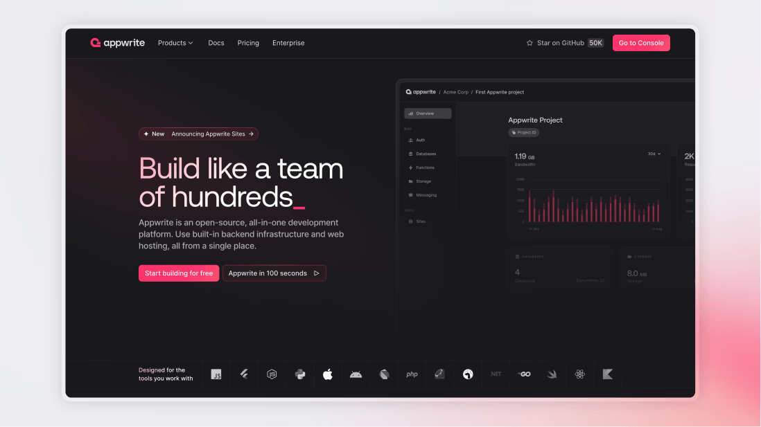
At Appwrite, we’ve grown from a Backend-as-a-Service into an open-source, all-in-one development platform. With the introduction of our newest product, Sites, we expanded our offering beyond backend services to include hosting. This shift meant our homepage needed to do more, it had to communicate the full breadth of what Appwrite now offers.
Phase 1: Setting the baseline
Before jumping into design changes, we wanted to understand how the homepage was performing. That meant:
- Recording baseline metrics of how our homepage was performing
- Getting fresh insight into what kind of first impression our homepage was giving to developers who were new to Appwrite
We ran a qualitative survey with 50 respondents who closely matched our target audience, but who were new to Appwrite. Instead of asking existing community members who already have a mental model of what Appwrite is, we wanted to get fresh insight into the first impression of a developer with no bias. The results were insightful.
What we heard:
- Positive: People liked the clean layout and visual design. Many said the structure was easy to follow.
- Confusing: Our messaging wasn’t clear enough. Some thought Appwrite was a DevOps tool, others a CMS, or just another Firebase clone.
This validated what we suspected: while the design was polished, the story we told wasn’t fully landing.
Phase 2: Iterating on the story
Based on those findings, we created a new homepage design in Figma and ran a second qualitative survey, this time on the proposed design with renewed messaging. The results were encouraging.
What we improved:
- Backend setup clarity: More users grasped what Appwrite offers, though some still wanted more detail on how the setup works.
- Scalability: Surfaced more often in feedback, indicating stronger visibility.
- Feature awareness: Users showed deeper engagement with our capabilities.
Phase 3: Final design
We simplified our messaging further and focused on showing, not just telling, what Appwrite offers. We:
- Added components that give a quick visual and conceptual overview of our offering, without requiring visitors to read everything. We honed in on different user behaviors: some people want a fast impression; others want to scroll deep. Our content now supports both. (This is backed by UX research; see Nielsen Norman Group's work on scanning vs. reading behaviors.)
Repositioned Appwrite from just a BaaS to a complete platform with Sites, our hosting solution, clearly integrated into the story.
Selected testimonials strategically, highlighting impact metrics like time saved, cost reduction, and scalability, to build credibility with both developers and founders.
While the main aim was to improve the story that we were trying to convey, we also further improved our visual language. We did a few iterations to further simplify our visuals and worked on an animation style that feels more natural. In our old page, we had animations based on scroll behavior that slightly hijacked user control, something developers disliked. The new animations and microinteractions make the page feel alive without taking away from the main purpose: understanding the story of Appwrite.
With all these changes, we moved into a final design iteration: the version that’s now live.
What’s next
We'll continue to refine our new homepage. There are still headlines we want to test, feature explanations to expand on, and new ways we can illustrate how Appwrite works.
Redesigning a homepage is about crafting the clearest possible introduction to your product. And that process doesn't end with this launch.