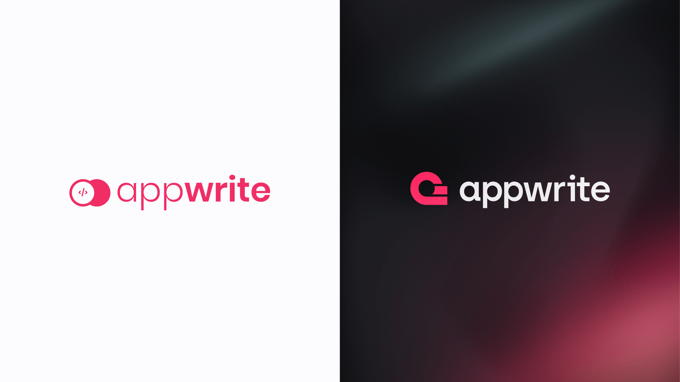
In the fast-evolving world of technology and software development, change is not just inevitable; it's essential for growth and progress. One of Appwrite's recent transformations has been the evolution of our logo. Today, we'll take you on the creative journey that led to our new logo's design and meaning - a journey with our community at its core.
How it started
Our first logo was initially designed by our CEO, Eldad. Its design aimed to align with our first slogan: 'Let's make coding fun again' - featuring rounded elements reminiscent of a gaming controller and the HTML symbol, which stood for our product's original focus.
Its vibrant pink color was inspired by a dress worn by our founder's partner, adding a personal and meaningful touch that ultimately set Appwrite apart from the crowd.
During that time, this design perfectly encapsulated Appwrite's playful nature.
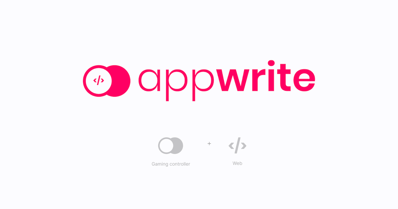
However, as Appwrite grew and evolved, it became increasingly clear it was becoming less aligned with our vision to empower developers to adapt to any platform, wherever they are.
The HTML symbol wasn't fully inclusive of the many coding languages we had started to support. Moreover, there were issues with scaling the logo down to smaller sizes, and a questionnaire revealed that the meaning behind our logo wasn't entirely clear.
We realized it was time for a change, time for a logo that not only embodied the core essence of Appwrite but could also scale with us on our journey of growth and development.
We transitioned from a playful approach to something a bit more serious, making Appwrite a platform that companies could rely on as they scaled.
Our creative journey
Crafting a new logo was no small task. It required meticulous planning, creativity, and a deep understanding of what Appwrite stood for.
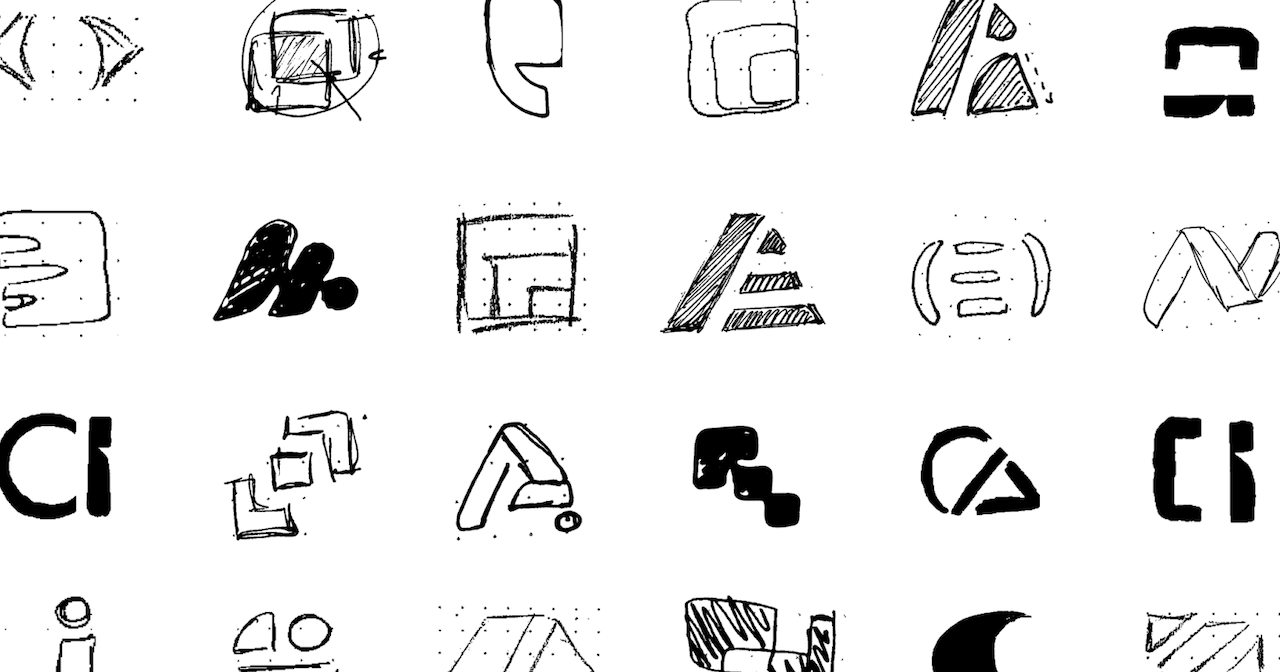
As the design process often starts with sketches, we first explored various concepts and ideas on paper. Once we had vectorized our ideas, we involved the broader team in feedback rounds to ensure we were on the right track. This provided us with invaluable insights and offered a fresh perspective on questionable aspects we might not have otherwise noticed.
While we initially experimented with obvious hints related to the coding world (such as coding symbols and interface elements) we soon realized that these, although relevant to our work, were somewhat generic and didn't truly embody what makes Appwrite unique.
Breakthrough moment
After many reviews, we finally pinpointed the elements we actually aimed to capture. The aspects that make Appwrite unique: our global community and the essence of coding.
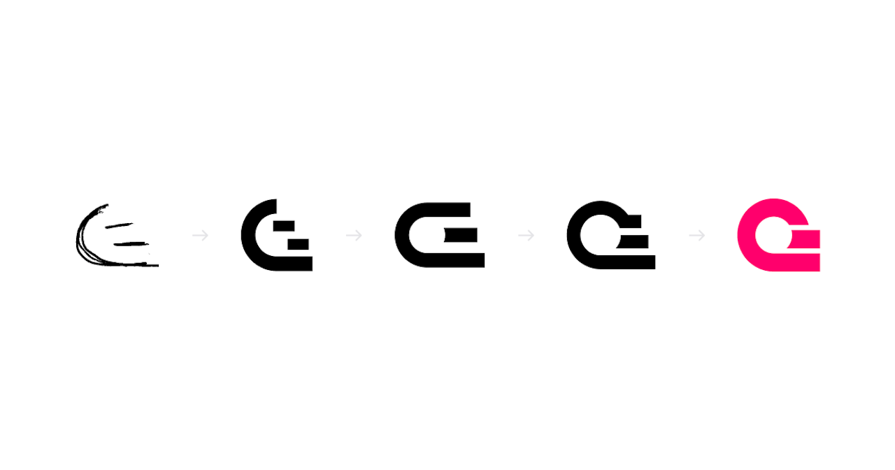
Through numerous iterations, one design stood out. A design that symbolized both our global community and the world of code.
With the design vectorized, it was time for final review rounds and tweaks. We fine-tuned the logo and conducted scaling tests to ensure it looked great at all sizes.
Our new logo
The result of this creative journey is a logo that reflects the essence of Appwrite. It's not just a symbol; it's a representation of our commitment to building a global community united by a love for code.
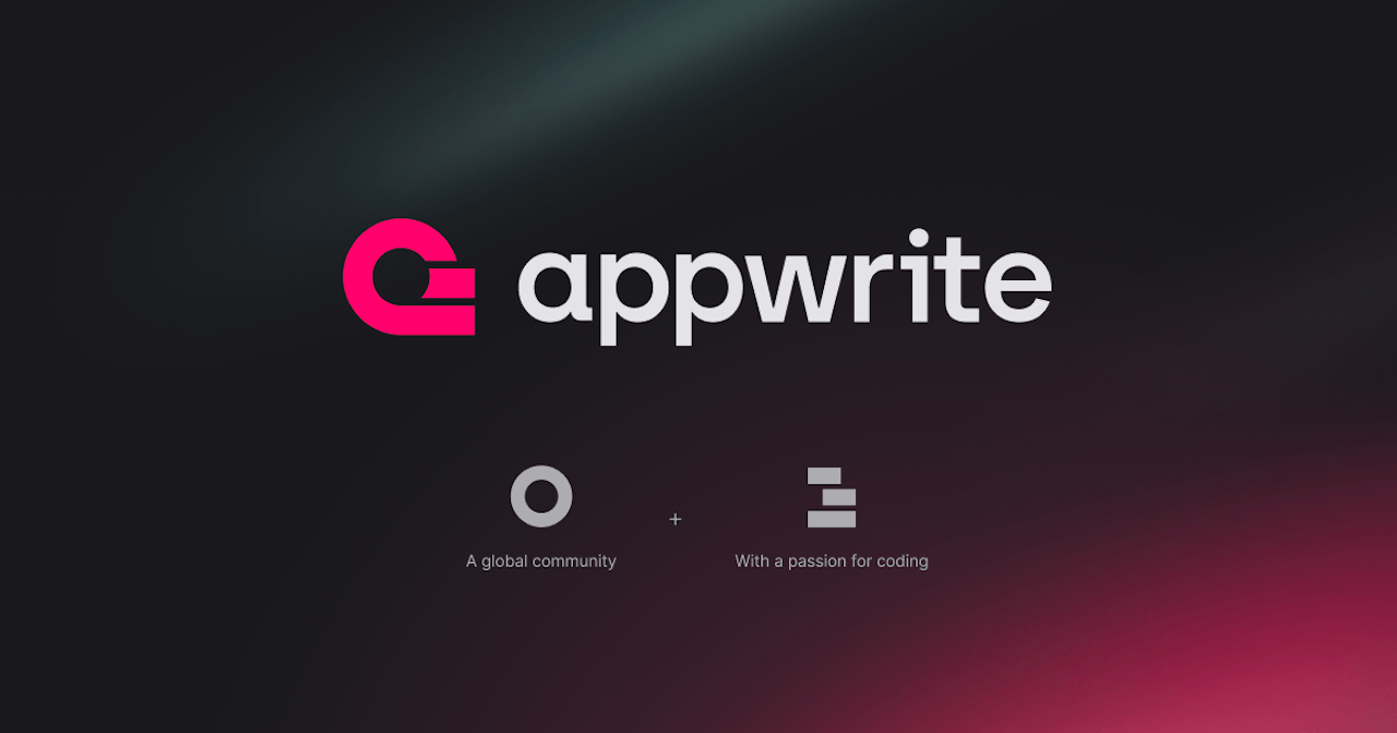
The new logo features lines that converge to form a globe. This represents our diverse and interconnected community spread across the world. It's a testament to the power of collaboration and inclusivity that drives Appwrite.
The lines in the logo evoke the idea of code - lines of code coming together to build something meaningful. This symbolism reflects the essence of our platform, empowering developers to create with ease and efficiency. These lines also feature prominently in our imagery style.
Finally, its overall look is reminiscent of the lowercase letter 'a,' standing for the first letter of appwrite.

Our new logo inspired the rest of our visual identity. Our website, promotional materials, and even documentation are now harmonized with this new identity, giving Appwrite a fresh, meaningful, and cohesive look.
The road ahead
The evolution of our logo is not just a visual change; it's a reflection of our growth, our commitment to our community, and our dedication to empowering developers worldwide.
As Appwrite continues to evolve, this new logo will serve as a symbol of our journey - a journey driven by innovation, inclusivity, and the limitless possibilities we're aiming to embrace in the world of software development.
We are excited to embark on this new chapter with our brand new identity. Together, we'll continue to build, code, and shape the future of software development. The journey has just begun, and the possibilities are endless, as we build like a team of 100.
