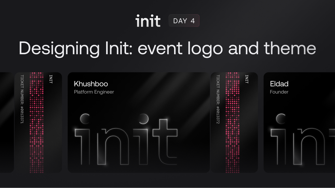
After the success of our first Init event in Spring of 2024, we knew there would be more coming soon, and that, visually, we had set ourselves a high bar. Even though Init is a fully online, virtual event, Appwrite’s visual design team created something tangible and interactive with the fully customizable, and shareable Init event tickets. In early July, knowing that our next event was just around the corner, we gathered again and began to brainstorm the visual design style that we wanted to bring to Init 2.0.
The Design process
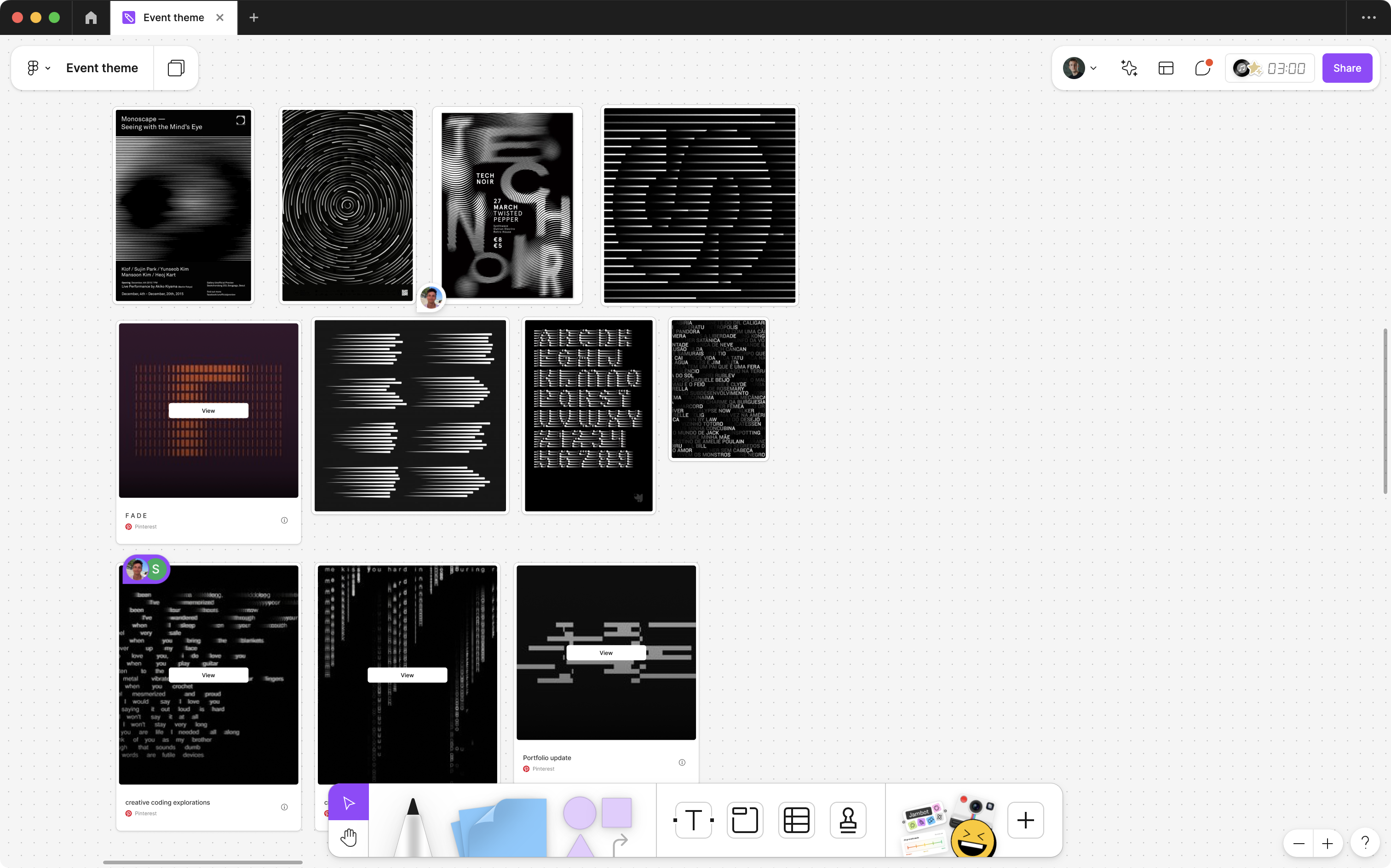
As a team, we always begin these design sprints with an empty FigJam board, where we can add notes, add screenshots that might give us inspiration, and have discussions about the things we like and dislike. Since this was our second time ideating for Init, we were able to apply many learnings from previous processes, which made this (and subsequent phases) feel more streamlined.
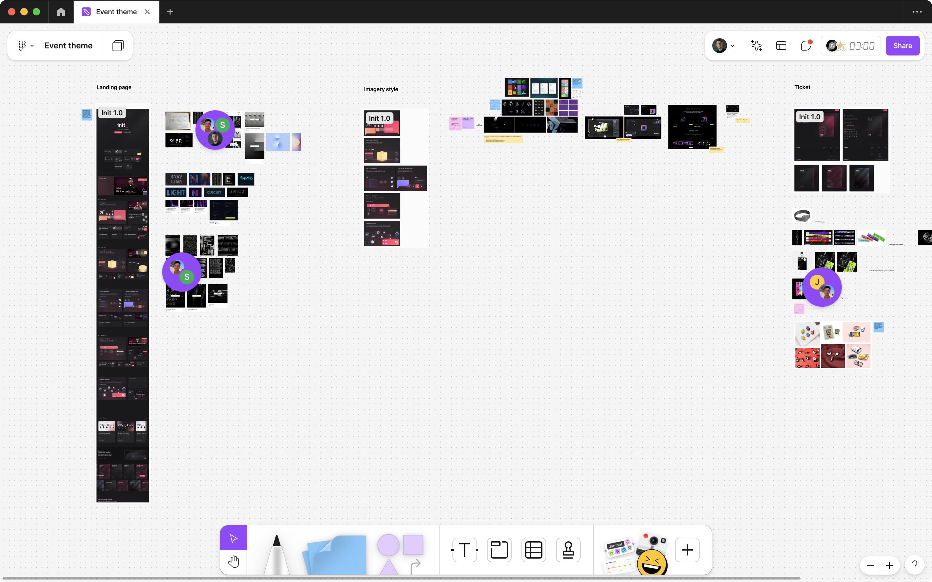
With the new feature set in mind, we needed to make sure that every piece of the design language was communicating the ways these new features would boost developer productivity, remove friction, and enhance performance. As we all gathered inspiration, we ultimately started to come together on the concept of line art; it felt dynamic and had a sense of organic movement that was in line with the key themes of performance that we wanted to focus on.
Once the team agreed on our visual style, we began to iterate on concepts.
Concepts
We had a few iterations of the event logo before settling on our final version. In situations like this, there can be a lot of value in iterating in code; it’s easy to preview, you can start to get a feel for the real world implementation, and once the team finds something that works the job is halfway done.
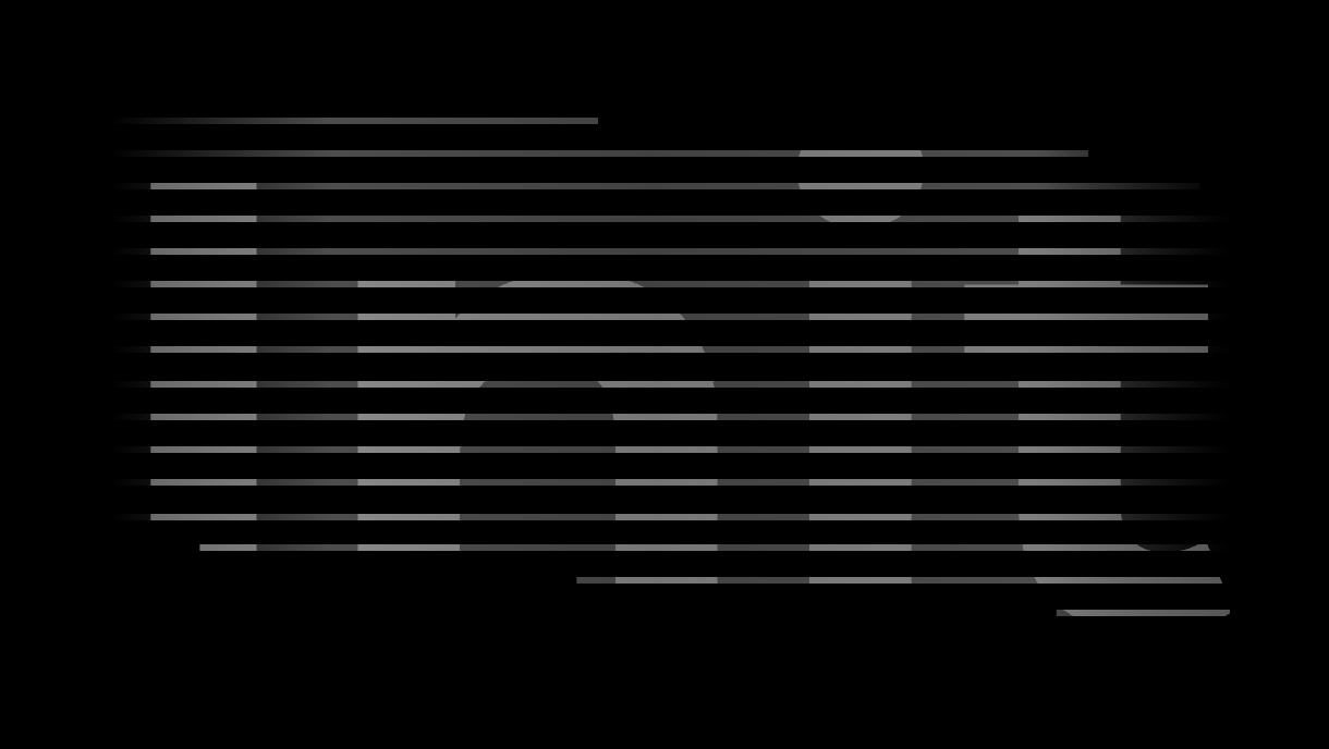
After several days of going back and forth, Jade gave us the version that we would end up going with, designed in Figma, and animated in After Effects.
We all agreed this was the right direction- it felt snappy and performant, but wasn’t so ornate that it would be impossible to build under a tight timeline. Once we had our conceptual animation, the challenge became translating it to the browser. In order to animate the stroke along the letter paths, I started with some of the gradient tracing concepts from Rauno Frieberg, but it was feeling like overkill (lots of JavaScript and an animation library), and it wasn’t quite getting us where we needed to go, looking more like a broad brushstroke animating in, rather than individual lines being drawn onto the paths.
What we ended up shipping was much simpler, and significantly more performant, relying entirely on CSS.
Animating the event logo
At Appwrite, we build our marketing site in SvelteKit, but these principles will easily translate into any component based framework.
Storing the letter paths in an array gave me lots of flexibility for how I wanted to render them. In this case, I rendered each one 3 times, which matched the number of individual strokes we wanted to have active on the event logo at any given point in the animation. Each path had an applied animation-delay ensuring they’d start at different points in the timeline, and set based on their index within the array.
<script>
export let duration: number = 8;

const paths = [
  "M53.9539 435.628V436.128H54.4539H122.654H123.154V435.628V132.776V132.276H122.654H1.28125H0.78125V132.776V192.884V193.384H1.28125H53.9539V435.628ZM45.2844 43.1913C45.2844 67.7464 64.0076 86.4606 89.1317 86.4606C114.256 86.4606 132.979 67.7464 132.979 43.1913C132.979 19.2098 114.251 0.5 89.1317 0.5C64.0121 0.5 45.2844 19.2098 45.2844 43.1913Z",
  "M192.548 436.366V436.866H193.048H261.248H261.748V436.366V257.776C261.748 219.898 289.852 191.232 327.135 191.232C361.528 191.232 387.899 217.007 387.899 254.308V436.366V436.866H388.399H456.599H457.099V436.366V238.125C457.099 206.802 446.513 178.645 427.561 158.314C408.606 137.979 381.307 125.5 347.942 125.5C307.462 125.5 279.604 144.522 266.161 167.691H261.748V133.513V133.013H261.248H193.048H192.548V133.513V436.366Z",
  "M549.557 435.628V436.128H550.057H618.257H618.757V435.628V132.776V132.276H618.257H496.885H496.385V132.776V192.884V193.384H496.885H549.557V435.628ZM540.888 43.1913C540.888 67.7464 559.611 86.4606 584.735 86.4606C609.859 86.4606 628.582 67.7464 628.582 43.1913C628.582 19.2098 609.855 0.5 584.735 0.5C559.616 0.5 540.888 19.2098 540.888 43.1913Z",
  "M665.033 193.069V193.569H665.533H717.628V345.073C717.628 377.254 727.344 400.095 744.533 414.88C761.707 429.653 786.262 436.313 815.804 436.313H868.976H869.476V435.813V375.127V374.627H868.976H816.382C806.04 374.627 798.835 372.328 794.202 367.485C789.565 362.637 787.406 355.136 787.406 344.495V193.569H872.444H872.944V193.069V132.961V132.461H872.444H787.406V48V47.5H786.906H722.174H721.674V48V132.461H665.533H665.033V132.961V193.069Z",
]
</script>

<svg
    class="lockup"
    viewBox="0 0 880 450"
    xmlns="http://www.w3.org/2000/svg"
    style="--duration:{duration}s"
>
    {#each paths as path}
        <path d={path} class="base" class:fill />
        {#each Array.from({ length: 3 }) as _, index}
            {@const delay = (duration / 3) * index}
            <path
                d={path}
                class="stroke"
                stroke="url(#stroke)"
                pathLength="1000"
                style:animation-delay="{delay}s"
                class:animate
            />
        {/each}
    {/each}
</svg>
With a few ways not to do the animation under my belt, the final step was finding the correct solution. I started experimenting with CSS animations, and while doing some digging, I landed on this Stack Overflow post, which gave me what I needed to start. Utilizing the power of stroke-dasharray and stroke-dashoffset I was able to create a simple animation, applying it to each path.
:root {
  --stroke-color: #333;
  --stroke-width: 2;
  --fill: hsl(var(--web-color-background));
}

.stroke {
  stroke-dasharray: 0 1000;
  stroke-dashoffset: 0;
  stroke-width: var(--stroke-width);
  filter: drop-shadow(0px 0px 1px rgba(255, 255, 255, 0.4));
  animation: stroke var(--duration) linear infinite;

  @keyframes stroke {
    0% {
      stroke-dasharray: 0 1000;
      stroke-dashoffset: 1000;
    }
    25% {
      stroke-dasharray: 500 500;
      stroke-dashoffset: 1000;
    }
    50% {
      stroke-dasharray: 500 500;
      stroke-dashoffset: 500;
    }
    75%,
    100% {
      stroke-dasharray: 0 1000;
      stroke-dashoffset: 0;
    }
  }
}
Applying the same animation properties to 75% and 100% is a nice little hack to delay an animation. The animation-delay property only applies to the first paint, so adding this, and extending the total duration made sure that the animation was completed by 75%, and there would be a pause, equivalent to 1/4 of the total duration, before it would start again. With this in place, the logo animation was how we’d envisioned it.
Animated lines
The background lines were much simpler.
<script>
  let lines: number = 2;
  const getRandomHeight = () => Math.floor(Math.random() * 100) + 75;
  const getRandomDelay = () => Math.floor(Math.random() * 2800);
</script>

<div class="container">
    <div class="lines">
        {#each Array.from({ length: lines }) as _}
            {@const delay = getRandomDelay()}
            {@const height = getRandomHeight()}
            <div class="group">
                <div class="line" style="--delay:{delay}ms;--height:{height}px;" />
                <div class="line" style="--delay:{delay}ms;--height:{height}px;" />
            </div>
        {/each}
    </div>
</div>

<style>
.container {
  position: absolute;
  overflow-y: hidden;
  display: flex;
  justify-content: center;
  align-items: center;
  inset: 0;
  z-index: -1;

  .lines {
    position: absolute;
    inset: 0;
    z-index: -10;
    display: flex;
    justify-content: space-between;
    max-width: 80%;
    margin: 0 auto;
    opacity: 0.7;

    --gradient: linear-gradient(
      to bottom,
      rgba(255, 255, 255, 0) 0%,
      rgba(255, 255, 255, 1) 50%,
      rgba(255, 255, 255, 0) 100%
    );
    --width: 2px;
    --starting-position: -80vh;
    --duration: 2s;
    --initial-delay: 0.5s;

    .group {
      display: flex;
      gap: 24px;
      position: relative;

      .line {
        position: relative;
        height: var(--height);
        width: var(--width);

        @media screen and (max-width: 768px) {
          height: calc(var(--height) / 4);
        }

        @keyframes line {
          from {
            bottom: var(--starting-position);
          }
          to {
            bottom: 15vh;
          }
        }

        &::after {
          content: "";
          display: block;
          position: absolute;
          bottom: var(--starting-position);
          width: var(--width);
          height: var(--height);
          background: var(--gradient);
          border-radius: 8px;
          filter: drop-shadow(0 0 2px rgba(255, 255, 255, 0.8));
          animation: line var(--duration)
            calc(var(--initial-delay) + var(--delay)) infinite forwards
            cubic-bezier(0.1, -0.6, 0.2, 0);

          @media screen and (max-width: 768px) {
            height: calc(var(--height) / 2);
          }
        }
      }
    }
  }
}
</style>
With this, we get 2 groups of 2 lines, each with a randomized height and animation delay, creating a subtle, dynamic backdrop for our lockup.
Expanding the theme: feature illustrations
Of course, the Init lockup was not the only component of design work needed for Init. This is a week-long event jam packed with daily announcements. To make every day of Init feel special, we wanted to create a series of visual assets that expanded on the event’s theme while serving as great visual support for each announcement.
We worked together with Appwrite engineers to understand how each new feature launched could be illustrated using the dynamic line art concept we developed. This resulted in a set of key illustrations we used across different channels such as campaign announcements on social media, website illustrations, blog covers, and animations.
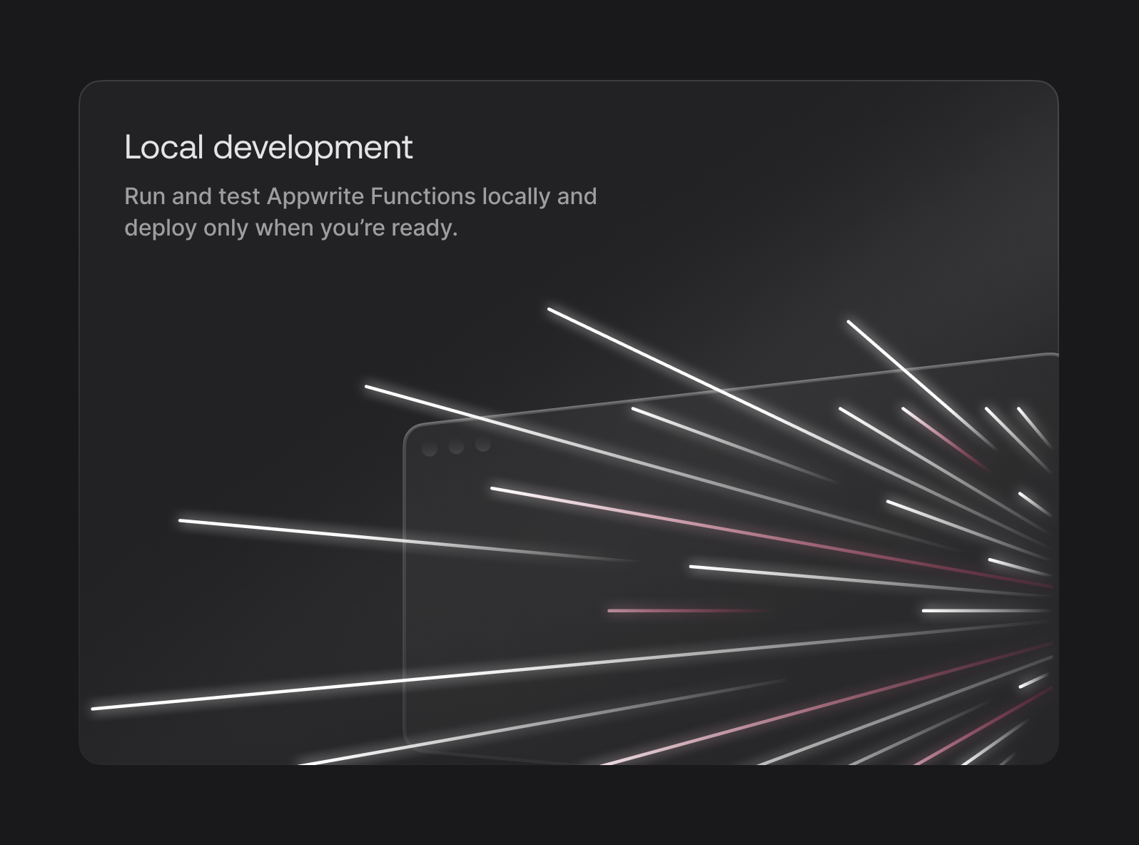
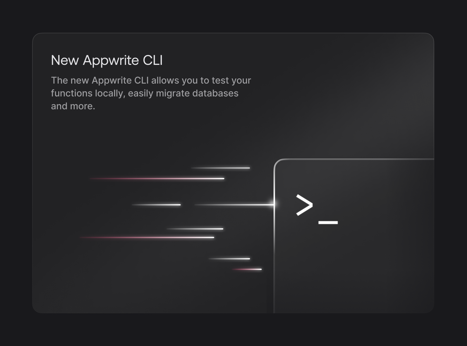
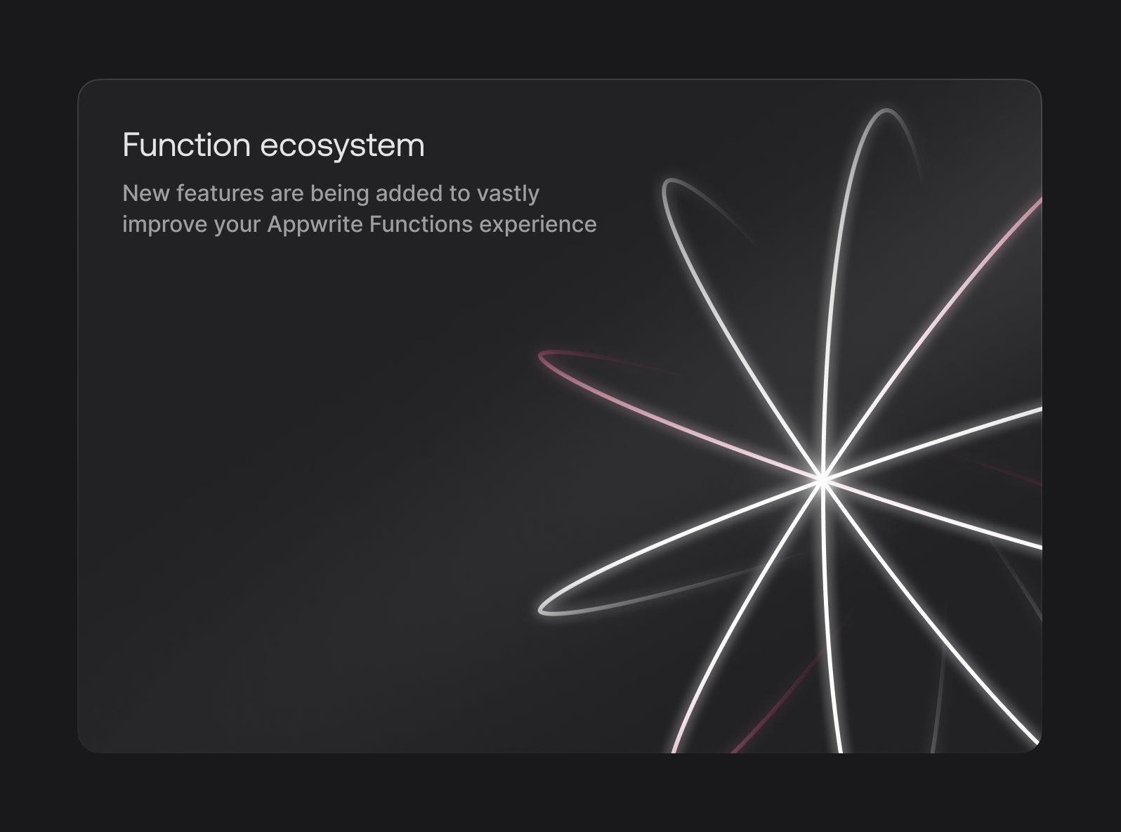
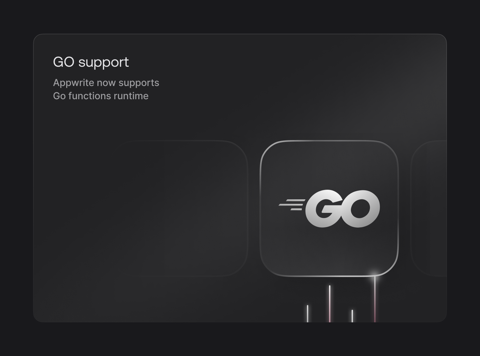
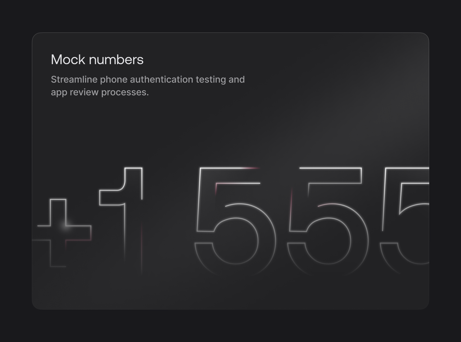
This helped expand the concept we began developing with the Init lockup and made the whole event’s identity feel more expressive, diverse, and complete.
Conclusion
As a design team, our goal is to do work that sets a standard of excellence for not only ourselves, but also the industry as a whole. Here, we set out to build something that was visually appealing, pushed the quality from 1.0, was performant, and fit the themes of our event. Through a lot of hard work, learning, and iteration, we feel as though we managed to do all four. We’re constantly evolving, and will build on what we learned here to make our next events, and every other surface even better. Keep an eye out, and thanks for joining Init!
