At Appwrite, we are constantly collaborating with the Appwrite community to improve Appwrite's products, services, and content. All for the sake of improving your developer experience, as well as staying true to the open-source values.
Today, we took another big step in improving this experience by elevating the Appwrite brand. Not only do we have an improved look and feel, but we also focused on delivering a better experience navigating our website and docs.
We are excited to share our new brand and to see it match the advancement of our products, services, and content. And how, together, and through the power of open source, we have the capabilities of hundreds of developers.
Aligning visual identity with growth
The very first design of Appwrite was created by our Founder & CEO, Eldad, in 2019 when Appwrite launched as an open-source project. Since then, the Appwrite Console has been through a design upgrade, but as Appwrite grew, so did the team. Making it possible to reach new heights with Appwrite’s overall brand identity.
With the Appwrite team and community growing, our product started to mature, and there was a disconnect between our broader visual identity and our product
With the Appwrite team and community growing, our product started to mature, and there was a disconnect between our broader visual identity and our product. Recognizing the need for a fresh and more mature appearance, we worked to align our visual identity with the growing advancement of our product. This rebranding effort represents our commitment to delivering a polished and sophisticated experience to developers, throughout the developer journey. From discovery to scaling in using Appwrite.
Designed for the community
Our rebranding journey began with a fresh perspective on our logo. We wanted to emphasize the importance of the Appwrite community, so we redesigned it to feature a globe and lines of code. This represents our global community members, working and coding together to form the letter 'a,' for Appwrite.
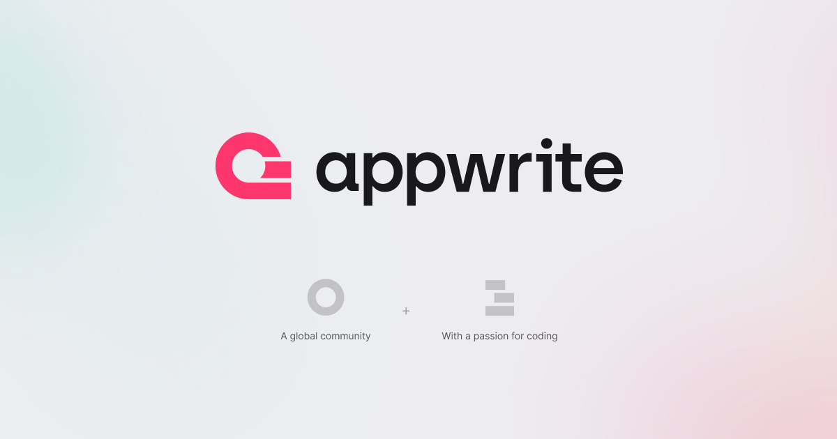
Our rebranding journey began with a fresh perspective on our logo. We wanted to emphasize the importance of the Appwrite community, so we redesigned it to feature a globe and lines of code.
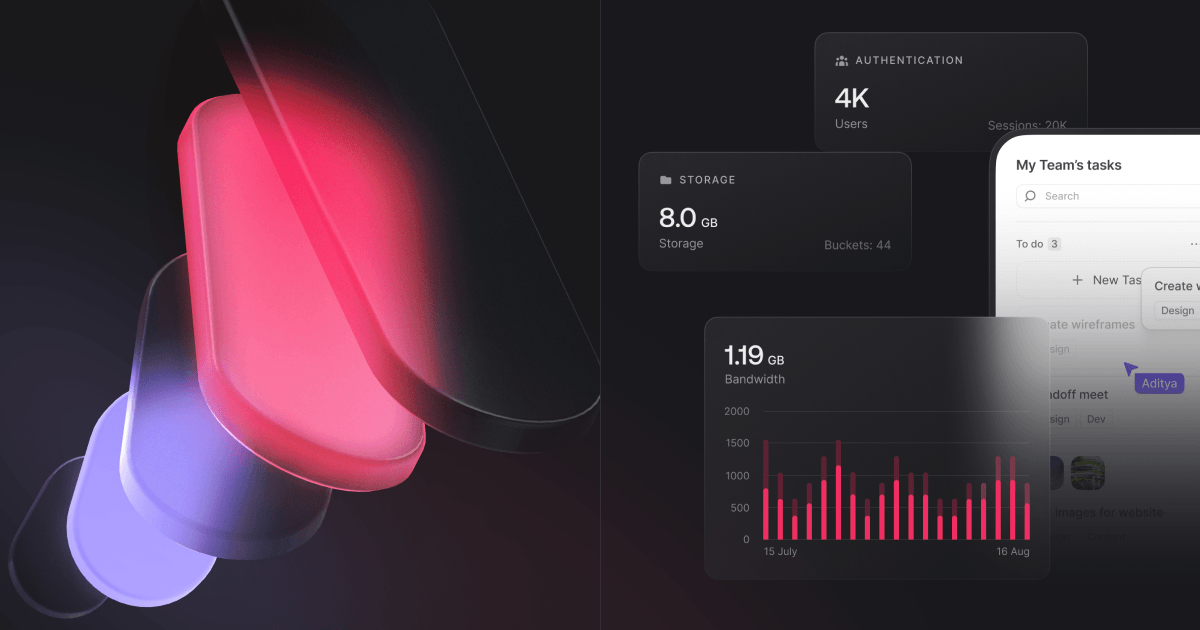
These code lines have become a recurring theme in our new 3D visuals, symbolizing progress and unity. We've also expanded our color palette to reflect our diverse and creative community, moving away from just pink. Warmer colors were added, to reflect the human and open side of our vibrant community.
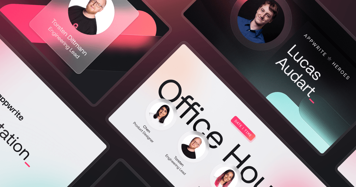
Additionally, we've added a new element: glass. This represents our commitment to transparency and openness, echoing our open-source values. It's integrated into our website and brand visuals, highlighting our dedication to collaboration within our global community.
Introducing our enhanced website and docs
Our upgraded website is the main product of our new brand bringing more pages explaining everything you need to know about Appwrite. We have more web pages to come explaining our products and features in more depth.
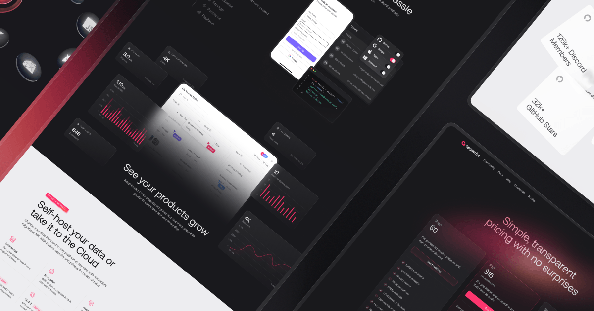
As part of our rebranding effort, we've revamped not only our website but also our documentation. Recognizing that our documentation plays a pivotal role in a developer's workflow, we've invested in enhancing both its design and content. Our new documentation now features specialized tutorials to guide you through project setup and feature implementation step by step.
Build like a team of 100
With open source at the heart of everything we do, community plays an important role at Appwrite. We believe that if we stay true to our philosophy, together, we will empower developers with the capabilities of hundreds of developers. Giving them the freedom to build, create, and innovate.
