Our brand’s main front-facing asset
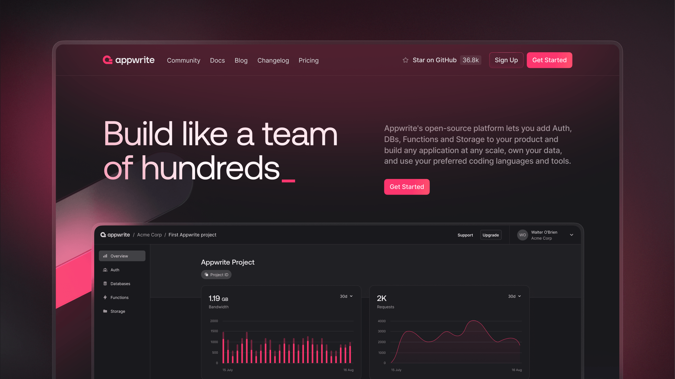
It is no surprise that the channel that gets the most traffic is our website. Not only that, it is where many of our developers start their journey of learning more about Appwrite, so we knew that it had to be one of the strongest case studies for our rebrand. It had to symbolize a big change in our journey, not only from a visual standpoint, but also in the presentation of its content.
We started this process by doing a thorough analysis of our site’s structure, figuring out what was working, what could be better, but also keeping in mind that this was an opportunity to improve and add to the overall presentation of our content. There was still some much-needed information still missing from our website, and we knew this was the perfect time to start brainstorming, writing, editing, and designing the pages in which that content would live.
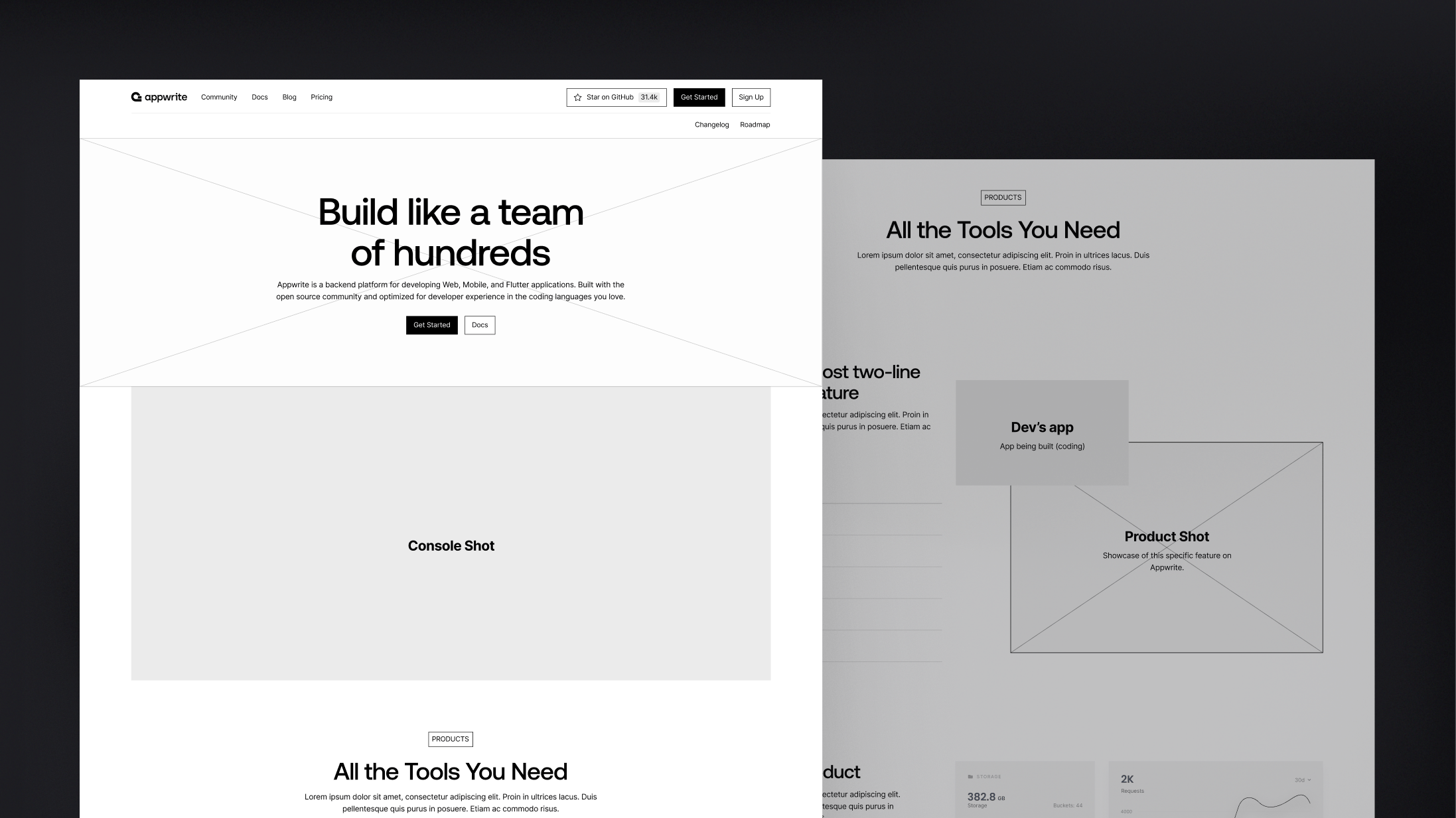
Once the overall content and site map was defined, we built wireframes to further test the navigation across pages, and made adjustments to the content being shown according to our tests. It is important to keep in mind that this process was all done before we even started to think about how our rebrand would be applied to the site, so as to not distract us from what was most important at the moment: defining the content.
Incorporating our brand identity
The website played a major role in defining some aspects of our brand identity, as we used it as one of the main channels for testing out visual concepts, typefaces, colors, etc. We had to make sure that our new identity’s foundations worked inside the web environment before anywhere else. We were able to make many major decisions based on how those would fare on the web. If it did not work at all inside this context, it would most likely not be too valuable of an idea to implement. This is not by any means a golden rule for best branding practices, but it was valuable to us because we were able to maintain visual cohesiveness across our channels even in the most experimental phases of the project.
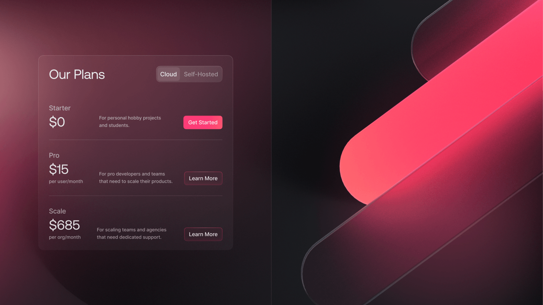
One of the concepts that worked well in the website was the use of glass-like elements. It sparked many ideas on how we could apply textures, lighting, blurring in the UI in ways that were both interesting and purposeful. One of the team’s favorite examples of applications of this idea were the illustrated icons we designed for the suite of products we offer at Appwrite, each one combining our signature pink color with a glass-like layer that would make up the entire composition.
Working with animations
We found that the rebrand was a great opportunity to breathe some life into our website. With this in mind, we hand-crafted unique animations that showcase our products’s functionalities while creating a pleasant page navigation experience for users. Working together with our engineering team, we were able to add a variety of details and happy moments while illustrating the power of Appwrite in our many use cases.
These animations were coded from scratch, using powerful tools such as Svelte’s transitions and native web animation API libraries, bringing interactivity and good performance together in harmony.
Designing the new Appwrite website was a very pleasurable and fun experience. It gave us the opportunity to improve areas that needed attention, to implement new ideas, and to foster experimentation every step of the way.
Moving forward, we want the both our website and documentation to be living environments that will keep evolving as we expand our offerings and improve our products.
