You’ve seen this exact conversation in support threads if you're active in any developer community.
"Have you read the docs?"
"No"
"Did reading the docs help?"
"Yes"
It’s convenient to just blame the developer for not reading carefully, but it’s also an opportunity to improve your developer experience. Over the past year, we’ve noticed conversations like this in Appwrite communities. We took it as an opportunity to grow.
"Why don’t they read the docs?" We wanted to find out.
Identifying the issues
The Appwrite team has always valued documentation as a core part of the product. After all, most adoption begins at the documentation. The old documentation was minimalistic and to the point and reflects our product philosophy. You can skim through it in one sitting and learn how to start building with Appwrite.
The old Appwrite docs are good but designed for a different audience and a different product. As Appwrite’s capabilities grow, so does the amount of documentation. More features simply need more words to explain, and the single-side navigation becomes more bloated with more information than we ever intended.
Appwrite also gained popularity. While Appwrite’s early adopters are experienced open-source tinkerers who are comfortable operating with less guidance and enjoy the old documentation’s brevity, the growing number of learners and students need more help. You can expect experienced developers to understand the purpose of a tool intuitively, but learners need to know how and when to use Appwrite.
Put simply, Appwrite’s documentation has to adapt to the changing needs of Appwrite’s growing capabilities and evolving audience.
Getting feedback
We view the Appwrite documentation as a product. So when we notice problems, we apply the same product design processes to address them. The Appwrite documentation needed an upgrade to adapt to Appwrite developers’ evolving needs.
Unlike many other projects, we already know what the problems are. We receive feedback from the "State of Appwrite" surveys, the Appwrite Discord community, issues on the docs repo, Office Hours questions, developer interviews, UX research activities, this discussion, and more. The open-source community’s feedback gave us a head start.
Planning the changes
First, we laid out the requirements for the new documentation. We identified key friction points: lack of a search bar, insufficient navigation depth to abstract complex concepts, difficult for the community to contribute, and incomplete coverage of the discover, evaluate, learn, build, and scale stages of a typical developer journey.
Then, we looked at other docs sites for inspiration. We liked various aspects of Stripe, React, Vue, and Datadog docs, which inspired our design process. We notice how their approach to documentation avoids or generates friction points. We took what we liked, and left out what didn’t work for us.
We also attend conferences like DevRelCon and Refactor DX to learn about the latest trends in developer experience, technical writing, and accessibility to evaluate our design's strengths and shortcomings. A bonus is the fresh eyes we pull aside every conference for in-person feedback, especially rare for a fully remote team like us.
Building the new docs
The new Appwrite docs need to cover the entire developer journey. This means it needs to help the developers discover Appwrite, evaluate its capabilities, learn to use Appwrite, build something useful, and scale it to support product growth.
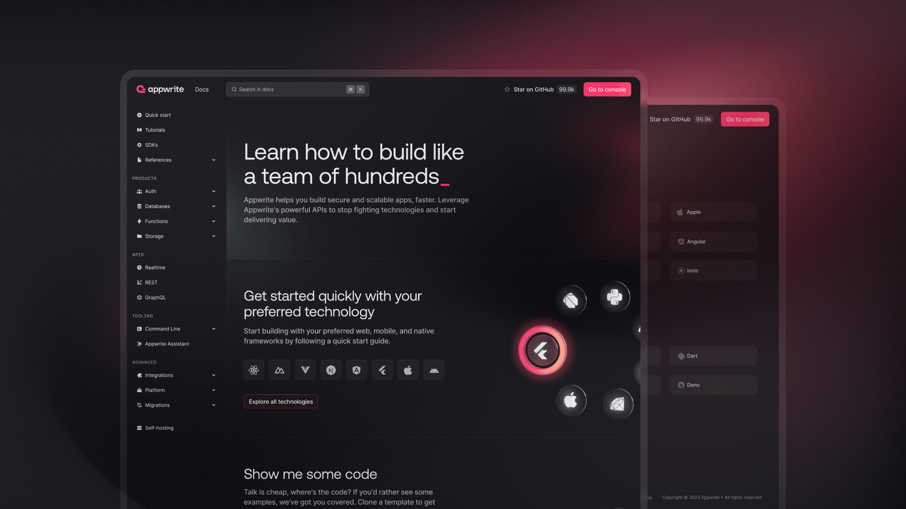
Appwrite’s new documentation has a navigation flow that aims to follow this journey. We introduced overview pages that introduce Appwrite’s capabilities, platform pages to help developers evaluate Appwrite’s design, more quick starts for frameworks to shorten the learning stage and build confidence, and expanded tutorials that help developers build and scale.
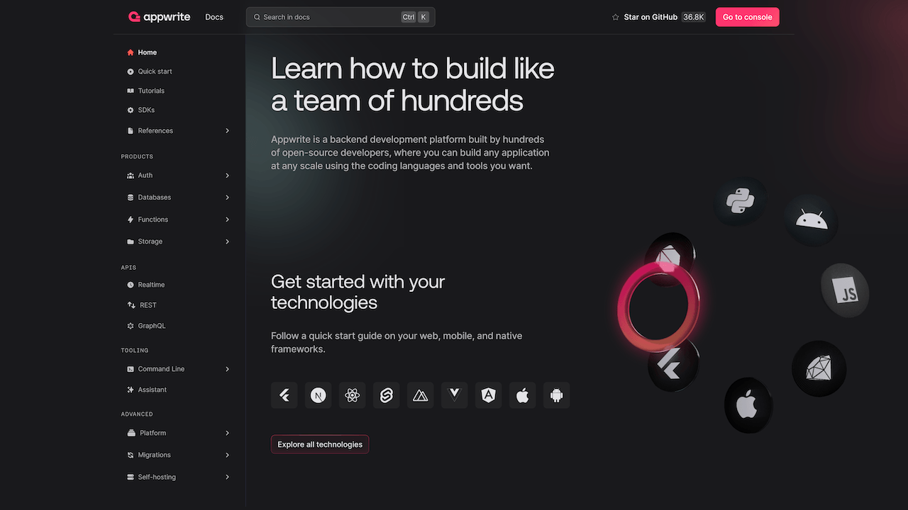
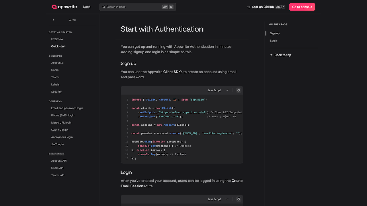
Developers loved the simplicity of the old Appwrite documentation, and we didn’t want to lose that part of our identity. Each deep dive section still begins with the same one-page quick start, which may be enough information for veterans. More comprehensive documentation and suggested usage are available, but further down the navigation.
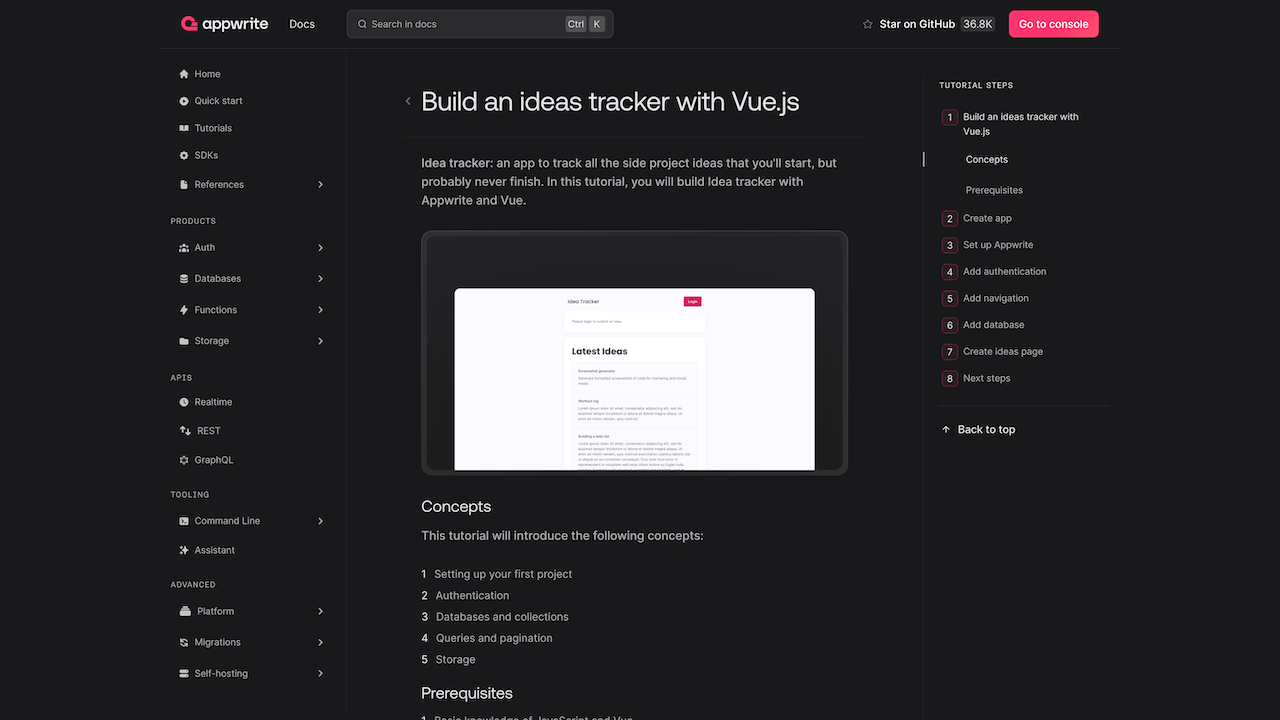
For learners and students, we added step by step tutorials to help you get to a working app faster and build confidence.
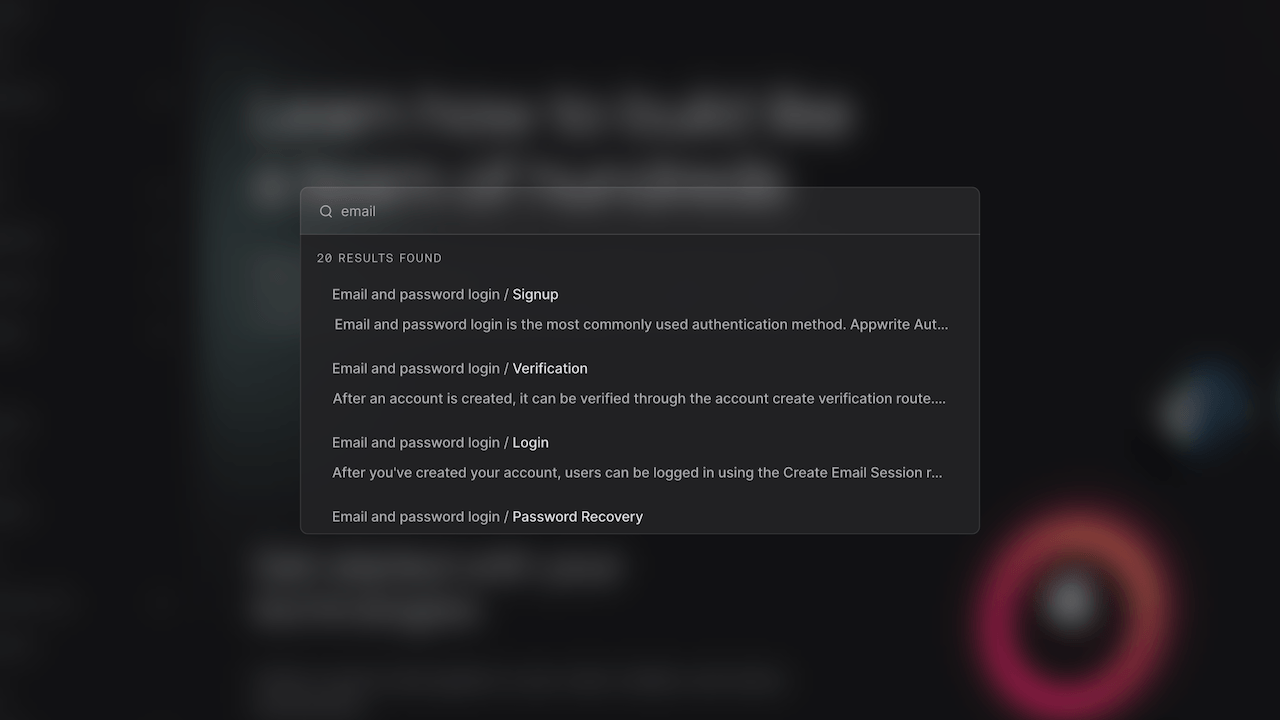
With all the new content, the new Appwrite docs also introduce search. Search helps keep Appwrite docs easy to navigate.
The new docs are written using an extended flavor of markdown made with Markdoc and Svelte, which makes community contributions easier. Markdown is easy to read and we can extend it with custom syntax like this multi-code selector.
{% multicode %}
```js
console.log("I'm javascript");
```
```py
print("I'm python")
```
{% /multicode %}
Which renders multi-select code fences like you find all over our docs.
console.log("I'm javascript");
The documentation source is easy for contributors to read and allows us to extend its syntax with powerful features.
Moving forward
The most important part of these changes is to give us room to grow. There is more room for content, especially community-contributed tutorials, quick starts, and integration guides. Truth is, while we build the Appwrite Platform, the community has built more successful and production-ready projects.
Even weeks after the launch of the new documentation, we’re already receiving a ton of help from the community through issues and PRs. With the power of open source, the new knowledge base for Appwrite developers will grow faster than ever before.
Checkout the Appwrite documentation on GitHub
